Transitions
This tutorial shows the application of spliceJAC to study cell state transitions, the change in gene regulation, and the driver genes that guide transitions. Specifically, we will cover the following aspects:
Proprocess that data and run spliceJAC
Study the change in gene signaling role upon state transition
Identify the transition driver genes and compare them with other methods
Distinguish transition genes leading to distinct final cell states starting from the same original state
We first import spliceJAC, as well as scanpy and scvelo:
[42]:
import scvelo as scv
import scanpy as sc
import splicejac as sp
Preparing the data for spliceJAC analysis
We will use the same pancreas endocrinogenesis dataset discussed in the GRN inference tutorial from Bastidas-Ponce et al. We will follow the same steps of the GRN inference tutorial to import and filter the data:
[11]:
panc_data = scv.datasets.pancreas()
We filter and normalize the dataset with default parameters used on the GRN inference notebook:
[12]:
scv.pp.filter_genes(panc_data, min_shared_counts=20)
scv.pp.normalize_per_cell(panc_data)
scv.pp.filter_genes_dispersion(panc_data, n_top_genes=2000)
scv.pp.log1p(panc_data)
Filtered out 20801 genes that are detected 20 counts (shared).
Normalized count data: X, spliced, unspliced.
Extracted 2000 highly variable genes.
Moreover, we compute the velocity using scVelo. These calculations follow the original scVelo tutorial, where these commands are explained in greater detail.
[13]:
scv.tl.velocity(panc_data)
scv.tl.velocity_graph(panc_data)
panc_data.uns['neighbors']['distances'] = panc_data.obsp['distances']
panc_data.uns['neighbors']['connectivities'] = panc_data.obsp['connectivities']
computing neighbors
    finished (0:00:00) --> added
    'distances' and 'connectivities', weighted adjacency matrices (adata.obsp)
computing moments based on connectivities
    finished (0:00:00) --> added
    'Ms' and 'Mu', moments of un/spliced abundances (adata.layers)
computing velocities
    finished (0:00:00) --> added
    'velocity', velocity vectors for each individual cell (adata.layers)
computing velocity graph (using 1/16 cores)
    finished (0:00:10) --> added
    'velocity_graph', sparse matrix with cosine correlations (adata.uns)
We will use the built-in scVelo PAGA method to identify the cell state transitionsin the data:
[14]:
scv.tl.paga(panc_data, groups='clusters')
computing terminal states
    identified 2 regions of root cells and 1 region of end points .
    finished (0:00:00) --> added
    'root_cells', root cells of Markov diffusion process (adata.obs)
    'end_points', end points of Markov diffusion process (adata.obs)
running PAGA using priors: ['velocity_pseudotime']
    finished (0:00:00) --> added
    'paga/connectivities', connectivities adjacency (adata.uns)
    'paga/connectivities_tree', connectivities subtree (adata.uns)
    'paga/transitions_confidence', velocity transitions (adata.uns)
We explicitly add the dataframe of PAGA-identified transition to the panc_data.uns for later use by spliceJAC:
[15]:
panc_data.uns['PAGA_paths'] = scv.get_df(panc_data, 'paga/transitions_confidence').T
The PAGA inference highlights 7 transitions in the dataset, which can be also visualized using scVelo’s built-in plotting tool.
[16]:
panc_data.uns['PAGA_paths']
[16]:
| Ductal | Ngn3 low EP | Ngn3 high EP | Pre-endocrine | Beta | Alpha | Delta | Epsilon | |
|---|---|---|---|---|---|---|---|---|
| Ductal | 0.0 | 0.098389 | 0.000000 | 0.000000 | 0.000000 | 0.000000 | 0.000000 | 0.000000 |
| Ngn3 low EP | 0.0 | 0.000000 | 0.236837 | 0.000000 | 0.000000 | 0.000000 | 0.000000 | 0.000000 |
| Ngn3 high EP | 0.0 | 0.000000 | 0.000000 | 0.247042 | 0.000000 | 0.000000 | 0.000000 | 0.000000 |
| Pre-endocrine | 0.0 | 0.000000 | 0.000000 | 0.000000 | 0.602254 | 0.159664 | 0.172915 | 0.117611 |
| Beta | 0.0 | 0.000000 | 0.000000 | 0.000000 | 0.000000 | 0.000000 | 0.000000 | 0.000000 |
| Alpha | 0.0 | 0.000000 | 0.000000 | 0.000000 | 0.000000 | 0.000000 | 0.000000 | 0.000000 |
| Delta | 0.0 | 0.000000 | 0.000000 | 0.000000 | 0.000000 | 0.000000 | 0.000000 | 0.000000 |
| Epsilon | 0.0 | 0.000000 | 0.000000 | 0.000000 | 0.000000 | 0.000000 | 0.000000 | 0.000000 |
[17]:
scv.pl.paga(panc_data, basis='umap', size=50, alpha=.1, min_edge_width=2, node_size_scale=1.5)
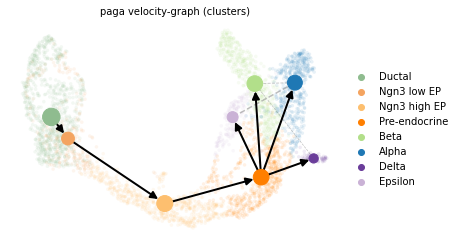
In particular, there is a linear transition from the Ductal state to Ngn3 low EP, Ngn3 high EP, to the Pre-endocrine state. Afterwards, Pre-endocrine cells follow four parallel transition paths and differentiate into Alpha, Beta, Delta and Epsilon cells, repsectively.
Finally, we run the spliceJAC inference and GRN statistics using the same functions and parameters discussed in the GRN inference tutorial:
[32]:
sp.tl.estimate_jacobian(panc_data, n_top_genes=50)
WARNING: Did not normalize X as it looks processed already. To enforce normalization, set `enforce=True`.
WARNING: Did not normalize spliced as it looks processed already. To enforce normalization, set `enforce=True`.
WARNING: Did not normalize unspliced as it looks processed already. To enforce normalization, set `enforce=True`.
Extracted 50 highly variable genes.
WARNING: Did not modify X as it looks preprocessed already.
Running quick regression...
Running subset regression on the Ductal cluster...
Running subset regression on the Pre-endocrine cluster...
Running subset regression on the Ngn3 low EP cluster...
Running subset regression on the Epsilon cluster...
Running subset regression on the Delta cluster...
Running subset regression on the Alpha cluster...
Running subset regression on the Beta cluster...
Running subset regression on the Ngn3 high EP cluster...
[33]:
sp.tl.grn_statistics(panc_data)
Analysis of signaling change during transitions
In the GRN Inference tutorial, we quantified the state-specific gene signaling roles defined by the incoming and outgoing regulation of each node in the GRN. With knowledge of the transitions, we can quantify the change in signaling role, for instance in the transition from the Ductal to Ngn3 low EP cell state:
[23]:
sp.pl.plot_signaling_change(panc_data, 'Ductal', 'Ngn3 low EP', figsize=(5,4))
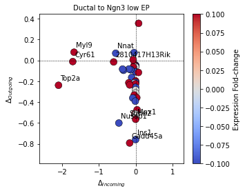
By default, the plot_signaling_change function highlights the top 10 genes with largest change from the starting to final cell states. These can be controlled with the optional arguments ‘show_top_genes’ (default: True) and ‘top_genes’ (default: 10). Depending on the spatial distribution of data points, the figure can be customized based on font size and figure size to improve readability.
Identify and plot the top transition genes
First, we use Scanpy’s built-in function to identify the top differentially expressed genes (DEG) of each cell state:
[34]:
sc.tl.rank_genes_groups(panc_data, 'clusters', method='t-test')
Afterwards, we use spliceJAC to identify the transition driver genes. spliceJAC has a built-in function to automatically analyze all transitions identified with PAGA:
[35]:
sp.tl.trans_from_PAGA(panc_data)
Alternatively, transitions of interest can be analyzed, one at a time, by specifying the initial and final cell states:
[30]:
sp.tl.transition_genes(panc_data, 'Ductal', 'Ngn3 low EP')
We can then use the plot_trans_genes function to visualize the top transition drive genes for each transition:
[36]:
sp.pl.plot_trans_genes(panc_data, 'Ductal', 'Ngn3 low EP')
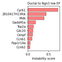
The plot_trans_genes is highly customizable, and it is possible to vary the number of top genes, plot color and size.
Furthermore, we can visualize the core GRN including the top marker genes of the starting cell state (defined based on DEG scores) and the top transition driver genes leading to the final state. This reduced GRN can be informative of which regulatory interactions might play an important role in regulating the gene expression and inducing the transition.
[46]:
sp.pl.core_GRN(panc_data, 'Ductal', 'Ngn3 low EP', figsize=(5,5))
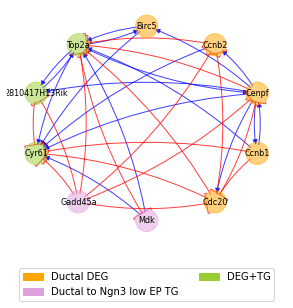
The core GRN highlights how certain genes act both as markers of the initial cell state and transition drivers, whereas other genes act only as marker or driver. The ‘standard’ DEG scores computed with scanpy and instability (aka transition) scores computed with spliceJAC can be computed to investogate their overlap:
[47]:
sp.pl.scatter_scores(panc_data, 'Ductal', 'Ngn3 low EP')
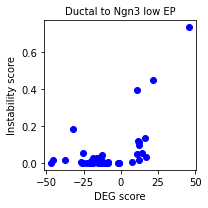
The plot highlights how Ductal DEGs tend to have high instability scores (i.e. strong driver genes) in the Ductal-Ngn3 low EP transition. However, there are instances of genes not identified through standard DEG analysis that are predicted as important drivers.
Identify the differential and conserved interactions during cell state transitions
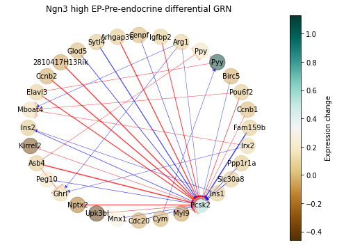
By comparing the inferred GRNs of the different cell states, we can further identify the key gene-gene interactions with important changes or highly conserved during cell state transitions.
First, we can visualize a ‘Differential GRN’ highlighting the interactions with more dramatic change, in this case in the transition from Ngn3 high EP to Pre-endocrine:
[48]:
sp.pl.diff_network(panc_data, 'Ngn3 high EP', 'Pre-endocrine', pos_style='circle',
                   figsize=(7,5), weight_quantile=0.975)
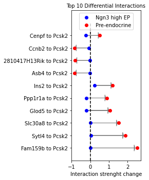
The change in these interactions can be also visualized more quantitatively:
[50]:
sp.pl.diff_interactions(panc_data, 'Ngn3 high EP', 'Pre-endocrine', title='Top 10 Differential Interactions',
                            loc='upper center')
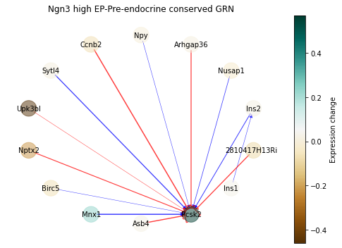
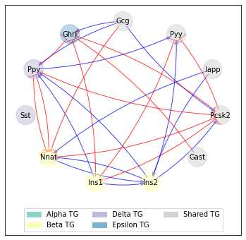
Similarly, we can plot a ‘Conserved GRN’ of gene-gene interactions that remained relatively unchanged:
[51]:
sp.pl.conserved_grn(panc_data, 'Ngn3 high EP', 'Pre-endocrine', pos_style='circle',
                          weight_quantile=0.95, figsize=(7,5))
and the strength of these interactions can be visualize quantitatively in a barplot:
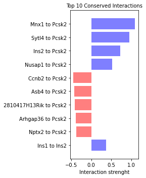
[52]:
sp.pl.top_conserved_int(panc_data, 'Ngn3 high EP', 'Pre-endocrine',
                              title='Top 10 Conserved Interactions')
Compare transition genes in bifurcating lineages
Finally, we can study the transition genes involved in “bifurcating” lineages where cells from a single initial state can differentiate into multiple states. In this dataset, Pre-endocrine cells can assume the Alpha, Beta, Delta, or Epsilon state. For this command, the initial cell state and list of final cell states typically need to be provided explicitly by the user.
First, we can visualize the driver genes associated with each transition. Some of these genes are shared between two or more transitions and which are unique to a single trasnition.
[53]:
sp.pl.tg_bif_sankey(panc_data, 'Pre-endocrine', ['Alpha', 'Beta', 'Delta', 'Epsilon'])
Moreover, we can visualize a reduced GRN that highlights the interactions between transition genes associated with the different transitions:
[54]:
sp.pl.bif_GRN(panc_data, 'Pre-endocrine', ['Alpha', 'Beta', 'Delta', 'Epsilon'])
Finally, we identify the standout genes that serve a distinct signaling role in one of the final cell states while being less active in the others:
[55]:
sp.pl.compare_standout_genes(panc_data, cluster_list=['Alpha', 'Beta', 'Delta', 'Epsilon'])
[ ]: