GRN Inference
This tutorial introduces the basic workflow of spliceJAC and the inference of cell state specific gene regulatory networks (GRNs). We will mostly discuss the main applications, whereas the theoretical foundation and motivations can be found elsewhere. Specifically, we will cover:
How to prepare your dataset to input the spliceJAC algorithm
Which considerations must be made when selecting spliceJAC parameters
Visualizing cell state specific GRNs
Quantifying the different genes’ signaling roles across cell states
Exporting spliceJAC’s results for your own downstream analysis
We first import spliceJAC, as well as scanpy and scvelo:
[23]:
import scvelo as scv
import splicejac as sp
Data loading and preprocessing
In this tutorial, we consider a pancreatic endocrinogenesis dataset originally published by Bastidas-Ponce et al on the journal Development. This dataset has been previously used in the scVelo tutorial, which we will follow to download and preprocess that data. First, we upload the dataset using scVelo’s built-in import method.
Note: the scv.datasets.pancreas() method will generate a path data/Pancreas/endocrinogenesis_day15.h5ad in your local folder. In the spliceJAC repository, we include a filtered version of this dataset under the datasets/Pancreas/pancreas.h5ad path.
[2]:
panc_data = scv.datasets.pancreas()
spliceJAC uses the unsplice and spliced RNA counts to infer the state specific regulatory interactions. The input dataset to spliceJAC should therefore have both the ‘spliced’ and ‘unspliced’ layers, as seen here:
[3]:
panc_data
[3]:
AnnData object with n_obs × n_vars = 3696 × 27998
    obs: 'clusters_coarse', 'clusters', 'S_score', 'G2M_score'
    var: 'highly_variable_genes'
    uns: 'clusters_coarse_colors', 'clusters_colors', 'day_colors', 'neighbors', 'pca'
    obsm: 'X_pca', 'X_umap'
    layers: 'spliced', 'unspliced'
    obsp: 'distances', 'connectivities'
To extract unspliced RNA counts from raw scRNA-seq data files, you can follow separate tutorials using tools such as velocyto or kallisto.
To preprocess the dataset, we filter genes with low counts and normalize counts using scVelo. We further select only the top 2000 genes for further analysis. All these filtering steps maintain the same filetring parameters of the original scVelo example, where you can also find a more detailed discussion of each individual scVelo function.
This dataset has 8 separate cell states following the differentiation from Ductal cells into differentiated Alpha, Beta, Delta and Epsilon cells. The cell states can be visualized using spliceJAC’s umap_scatter function. The umap_scatter function includes several optional parameters to adjust and customize figure size, font size, colors, and legend position.
[4]:
scv.pp.filter_genes(panc_data, min_shared_counts=20)
scv.pp.normalize_per_cell(panc_data)
scv.pp.filter_genes_dispersion(panc_data, n_top_genes=2000)
scv.pp.log1p(panc_data)
Filtered out 20801 genes that are detected 20 counts (shared).
Normalized count data: X, spliced, unspliced.
Extracted 2000 highly variable genes.
[5]:
sp.pl.umap_scatter(panc_data, fontsize=8, ncol=3)

Running spliceJAC
The most important parameter in spliceJAC is the number of selected genes. Since we want to compare the genes role across different cell states, we aim at selecting a set of genes. Furthermore, to ensure a unique solution, we require the number of genes, which are the variables in the regression problem, to be smaller than the number of cells, which are the observations. In this dataset, the Delta state has 70 cells and is thus the smaller state:
[6]:
panc_data.obs['clusters'].value_counts()
[6]:
Ductal           916
Ngn3 high EP     642
Pre-endocrine    592
Beta             591
Alpha            481
Ngn3 low EP      262
Epsilon          142
Delta             70
Name: clusters, dtype: int64
Therefore, n=70 represents an upper bound to the number of selected genes. Furthermore, spliceJAC repeats the inference multiple times (nsim=10 by default), each time subsampling a percentage of the state’s cells. Using the default fraction value of p=0.9, each individual regression iteration of the Delta state will have only n*p=63 cells. The maximum number of top genes for spliceJAC inference is therefore n_top_genes=63. spliceJAC has a built-in check and will raise an error if the selected numebr of genes exceeds the upper limit. In this tutorial, we will round down to n_top_genes=50.
The estimate_jacobian function includes other optional arguments, most importantly:
The regression method can be chosen between linear, ridge or lasso regression (default=Ridge)
The shrinkage coefficient for ridge or lasso regression (default=1)
Furthermore, it is assumed that the cell annotations are found in the adata.obs[‘clusters’]. It is worth stressing that spliceJAC will treat each distinct cell annotation as a different stable cell state. Thus, you can edit your cell annotations, for instance by deleting or merging certain annotations, if you do not want to treat certain states as stable attractors.
The cell state specific GRNs are identified with the estimate_jacobian function:
[7]:
sp.tl.estimate_jacobian(panc_data, n_top_genes=50)
Filtered out 55 genes that are detected 20 counts (shared).
WARNING: Did not normalize X as it looks processed already. To enforce normalization, set `enforce=True`.
WARNING: Did not normalize spliced as it looks processed already. To enforce normalization, set `enforce=True`.
WARNING: Did not normalize unspliced as it looks processed already. To enforce normalization, set `enforce=True`.
Extracted 50 highly variable genes.
WARNING: Did not modify X as it looks preprocessed already.
computing neighbors
    finished (0:00:08) --> added
    'distances' and 'connectivities', weighted adjacency matrices (adata.obsp)
computing moments based on connectivities
    finished (0:00:00) --> added
    'Ms' and 'Mu', moments of un/spliced abundances (adata.layers)
Running quick regression...
Running subset regression on the Delta cluster...
Running subset regression on the Epsilon cluster...
Running subset regression on the Ductal cluster...
Running subset regression on the Beta cluster...
Running subset regression on the Ngn3 high EP cluster...
Running subset regression on the Alpha cluster...
Running subset regression on the Pre-endocrine cluster...
Running subset regression on the Ngn3 low EP cluster...
A general note about plotting and saving figures
All spliceJAC’s plotting functions provide many possibilities to customize figure as well as exporting in all formats supported by matplotlib. In particular, four arguments allow figure plotting and saving:
showfig (default=None): by providing showfig=True, the figure will be showcased in matplotlib’s plotting interface. showfig=None will still showcase the figure in a jupyter notebook.
figname (default=None): a figname argument will be used to generate and save the figure. Therefore, figname should start with the file path and end with the file extension.
format (default=‘pdf’): the figure format. Make sure that the figname extension and format arguments are not conflicting
figsize (default depends on function): the size of the function can be customized, and it is provided as a tuple (width, height)
Overview of state-specific GRN and stability considerations
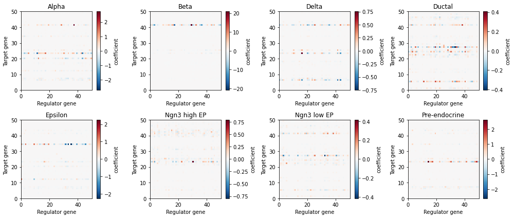
We can visualize the context-specific interactions by plotting the gene-gene interaction matrices of each cell state in a heatmap-style plot when positive coefficients (red) imply an activation from the regulator gene (x-axis) to the target gene (y-axis), while negative coefficients (blue) imply inhibition.
[8]:
sp.pl.visualize_jacobian(panc_data)
Similarly, we can inspect the stability of the cell states with eigenvalue plots. Negative eigenvalues of the cell state Jacobian matrix imply stability, whereas positive eigenvalues imply instability. Therefore, the percentage of positive eigenvalues in each cell state is indicative of the relative stability of the state.
[9]:
sp.pl.eigen_spectrum(panc_data)

Visualize the GRNs and gene signaling roles
We now explore the visualization and analysis of the state specific GRNs. The visualize_network function provides a way to plot the GRN of a cell state with varying levels of detail:
[15]:
sp.pl.visualize_network(panc_data, 'Ductal', weight_quantile=.98, pos_style='circle', plot_interactive=False)
There exist multiple connected components. Choose the parameter cc_id to show other components

In particular, the weight_quantile argument bounded in [0,1] allows to select only the strongest interactions in GRN. For example, setting weight_quantile=.98 selects only the strongest 2% of interactions. Furthermore, the pos_style controls the spatial locations of the nodes. pos_style=‘circle’ (as above) arranges the nodes in a circle, whereas the default pos_style=‘spring’ (below) uses the built-in Networkx method to arrange nodes randomly. More permissive weight_quantile thresholds result in larger networks, which might require adjustment of other function argument for visualization.
[16]:
sp.pl.visualize_network(panc_data, 'Ductal', weight_quantile=.95, pos_style='spring',
                        plot_interactive=False, figsize=(8, 6))

Finally, setting plot_interactive=True (default option) will exploit Networkx’s interactive plotting tools to generate a version of the GRN that can be interactively rearranged for exploration. You can try this one out in your own notebook!
The GRN of each cell state can be exported to csv file by calling the sp.tl.export_grn(adata, cluster, filename=None) method, where:
adata is the count matrix object
cluster is the name of cell state, such as ‘Ductal’
filename is the name of the csv file including file path (optional). If no filename is provided, spliceJAC will create a results/exported_results/ folder and store the file therein.
We can extract more quantitative information about the gene roles within each GRN by calling the method grn_statistics:
[17]:
sp.tl.grn_statistics(panc_data)
After running the method, we can visualize the cell state specific signaling roles of genes in a incoming-outgoing signaling scatter plot, in this case for the Alpha cell state:
[19]:
sp.pl.plot_signaling_hubs(panc_data, 'Alpha')

In this plot, the incoming (x-axis) and outgoing (y-axis) signaling scores of each gene are quantified by the weighted sum of incoming/outgoing edges in the Pre-endocrine GRN, respectively. Furthermore, the colormap depicts the gene expression within the Pre-endocrine cell state.
Quantify signaling role variation across cell states
Furthermore, spliceJAC can quantify the change in gene roles across the cell states by comparing the GRN statistics across states. The gene_variation function provides an overview of the genes whose signaling roles are more or less conserved across the cell states:
[20]:
sp.pl.gene_variation(panc_data, method='inter_range')

The gene role comparison can be performed using various metrics, including: betweenness centrality of the gene in the GRN, incoming or outgoing signaling strength (defined in the previosu section), or “total signaling” defined as incoming+outgoing, which can be selected by modifying the ‘measure’ argument.
Moreover, the comparison across clusters can be performed with different metrics as well, including standard deviation (‘SD’, default), range (‘range’) and interquartile range (‘inter_range’). You can use the ‘method’ argument to change the preferred comparison metric.
The gene_var_detail function allows to zoom on the most variable genes and inspect their signaling roles across the different cell states in detail:
[21]:
sp.pl.gene_var_detail(panc_data, measure='centrality')

Finally, the ‘gene_var_scatter’ function provides a general overview of the genes that are both highly expressed and exhibit very state-specific behavior by plotting the inter-state gene variation as a function of average gene expression across clusters. This analysis can serve as an initial step to identify key genes for further investigation.
[22]:
sp.pl.gene_var_scatter(panc_data)

[ ]: